But this new job is killing my free time.
Anyway, I was able to spend a little time watching a training video on using the pen tool. I'm going step by baby step, but I'm determined to grasp the concepts and become competent in using the pen tool.
The first step in learning how to use it is learning how to set it up. In the process, I'm learning what all the little symbols that appear and vanish next to the icon mean.
In early December, I'm hoping to get new glasses. The ones that I've got are not up to the task of reading all the little symbols without some squinting and straining.
Monday, November 21, 2011
Monday, August 29, 2011
A Thought
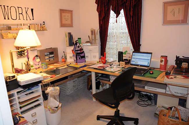
Storage is not organization. Nor is organization storage. You can put everything away and not know where anything is, and you can know where everything is when nothing is put away.
Me, I prefer to know where everything is when it is put away. Therefore, when I am working, I put things away instead of put them down. If I need a tool that I used ten minutes ago I don't have to search through the things scattered around my work surface, I simply reach to the location where I know that tool is stored.
Me, I prefer to know where everything is when it is put away. Therefore, when I am working, I put things away instead of put them down. If I need a tool that I used ten minutes ago I don't have to search through the things scattered around my work surface, I simply reach to the location where I know that tool is stored.
Saturday, August 6, 2011
Tidy Up
I just spent a pleasant afternoon tidying up a lot of files that I'd downloaded and hadn't sorted out. Time spent doing that is not wasted. I can find the files that I want because I know where they are. I have a file system with clear labels that let me know what is inside the file. If you look at my studio, you'll realize that I label drawers.
I'm about to spend some time sorting through Hypatia, my Kindle. I've downloaded samples and haven't deleted them after I purchased the book. My directory of sample books is getting cluttered.
I'm about to spend some time sorting through Hypatia, my Kindle. I've downloaded samples and haven't deleted them after I purchased the book. My directory of sample books is getting cluttered.
Saturday, July 23, 2011
PTotD
Tip # 130. The process for saving presets of different types, meaning shadows, styles, Brushes and so on, is functionally the same process. If you can save a style, you can save a Brush and so on. If you aren't paying attention, you'll save things that you didn't want to save included with the things that you did want to save.
I'm thinking of a kit that went up for sale and the designer had included a set of styles in her kit. But since she hadn't been paying attention, she'd saved a set of styles that included ones that were not for sale. She bought them from a different designer and hadn't meant to include them.
The trick is to select only the objects that you want to save in the Preset Manager. The lines around the different styles or Brushes or whatnot will be heavy if the item is selected. Use your Command or control click to select more than one. Shift click will work as well. Only the do you want to click on the save set button.
Don't forget to give your set a descriptive name when you save it!
Monday, June 27, 2011
Photoshop Tip of the Day
An old joke in my family ran like this:
A man is lost in New York City. He can't find Carnegie Hall. He stops and asks a wino, "How do you get to Carnegie Hall?" The wino paused a moment and answered, "Practice, man practice!"
That's pretty much what I heard from an airbrush expert this past weekend. He spends time doing drills, thousands of them. He can create strokes that look identical because he's done it thousands of times. I'm not saying you need to press the keyboard shortcut for the Brush tool a thousand times. You do need to continually practice what you learn. Use it or lose it.
Sunday, June 26, 2011
Organization
A large part of using Photoshop is being able to find the graphics you are going to work with. This means organizing your photos and organizing the kits, templates, overlays and so on that you have bought. Spending time learning shortcuts to work faster will do you no good if you are wasting time searching for your files.
Organize in a way that works for you. Using a system that someone else created won't help if your brain doesn't work that way. If you think in dates, working best chronologically, a system that uses names in alphabetical order won't work for you. The one thing that will help any system is to use complete words. If you are labeling something from a trip to Orlando, "Orl" is not the best choice. "Orl" could also stand for "New Orleans" or "Oriole."
Don't think you must purchase fancy software to organize your images. I managed for many years simply using the directory structure of files, folders and sub-folders present in Windows. Now that I own the fancy software, I still use that structure as the base of the system.
Monday, May 9, 2011
PTotD
Tip #129. Those Swatches that are available in the Color/Styles/Swatches panel by default are a fast and easy way to select a color. The cursor will turn into an eyedropper when it is over the swatches panel and a fist will let you know that you have successfully clicked to grab a color. Glance over at the background/foreground icon to make sure that you got the right one. Hover your cursor over a swatch to see what it is named. If you right or option-click in the panel, you can save a color you like as a swatch. Make sure you give it a descriptive name. You use the Preset Manager to save your swatches as an .aco file. They aren’t saved unless they are in a file you can back up. Photoshop will remember them if you close down the application, but that doesn’t mean they are saved!
Sunday, May 8, 2011
PTotD
Tip# 128. Gradients are a great way to put a little more interest into a background. Give this a try. Open a document and put in a ho-hum kind of background. Create a new layer above it. Select black or some dark color from your swatches and then select the Gradient tool. The Keyboard shortcut is the letter G. You might get the paint bucket first, but you want the Gradient tool. Then go to the options bar and select from the second drop-down from the left to set the kind of gradient. The first choice is from a foreground color to white, and the second one is from the foreground color to transparent. You want to use the transparent option. Then look at the icons.to the right of that. The first one is a horizontal gradient, the second is a radial gradient, the third is Angle, the next is reflected and the last one is diamond. If you hover your cursor over the icons, you’ll see a name pop up. The one you want for this is the radial gradient. Next, click inside your layout somewhere around 10:00 and drag down towards 4:30. A line will appear, indicating the direction of the gradient. When you release the drag, a layer of color will appear that fades from your start color and start point down to transparent at the end point. Whee!!! If you want it to be darker or lighter, select a different color, change the opacity of the layer, or make the drag line start and end in different places.
Saturday, May 7, 2011
Photoshop Tip of the Day
Tip # 127. When making a tricky selection, there isn’t anything wrong with making adjustments to your image to make the selection tools work better. Your goal is a good selection. You can add an adjustment layer, and tweak the contrast to be incredibly wrong, for example. Just ditch the adjustment layer after the selection is made. Or, if you are using Smart Objects, you can revert back to the original. Wow. What a concept.
Friday, May 6, 2011
PTotD
Tip # 126. A Smart Object can be defined as an object, which may be composed of multiple layers/objects or a single layer/object, which remembers what it used to be, so the changes you make are not permanent and can be reversed. A smart object has a marker in the lower right corner of the icon in the layers panel to indicate that it is a Smart Object. The marker looks like three images, with one black and two white. You can create Smart Objects several ways. Right or control-click on the layer in the layers panel and select Convert to Smart Object. Or you can go to Layer | Smart Object | Convert to smart object. You can control or right-click on the object in your layout and select convert to Smart Object. You can even convert for a smart filter through the Filter menu, which will create a Smart Object. When you drag and drop an image from MiniBridge in CS5, it will import as a Smart Object. It will have bounding box that includes an X through the center. Hit Enter, and it will be a smart object. Smart Objects do have a few limitations, but in general, they are useful, because you retain the ability to undo changes, even after saving and closing the file.
PTotD
Tip # 125. Ever open a file, make a few changes and immediately hate them? You want to go back to the freshly opened file and start over again, but you don’t want to undo, use the History, or close without saving changes and then open the file again. Just go to the file menu and select revert. Your file will go back to the way it was when you first opened it.
Wednesday, May 4, 2011
PTotD
Tip #124. As usual, Photoshop has more than one way to get to the same settings for the Brush tool. The keyboard shortcut for the Brush tool is the letter B. Have you noticed that many of the keyboard shortcuts for the tools are the bottom row of letter keys? Ahem. In the options bar, from left to right, you’ll see first an icon of the tool you have chosen. There will be a dropdown arrow next to that tool icon. If there are presets for that tool available, they will be listed. Don’t be confused by the word ‘presets’. There are other brush presets that you’ll need to know more about. Next to that, will be an icon of the selected brush and a dropdown arrow. If you choose that, you’ll get to a pared-down panel for selecting brushes and changing the size and hardness of the brush. The number in the pictures you see will let you know the size of the brush. It’s the larger of width or height in pixels. Next to that is an icon of three brushes in a jar. Clicking on the icon will open up the brushes panel, which includes tabs for brush presets, brush settings, and clone source. Now that you know where to go to change brush settings, it’s time to play. See ya later!
Tuesday, May 3, 2011
PTotD
Tip #123. Those blobby/spiky shapes for the brush tool are great when you want to apply an action, but softly, gradually. Say I want to erase something, so I can see through it to the layer below, but I want the top layer to remain in ghost-like fashion. Instead of doing a selection with a feathered edge and playing with blend modes, I can use a soft brush to erase what I don’t want. And with a soft, blobby brush, I can work gradually. If you are trying to do things like this with a mouse, you won’t have pressure sensitivity. If you have a tablet, you are good to go.
Monday, May 2, 2011
PTotD
Tip #122. The Eyedropper tool you use to take a color sample can take a sample of a single pixel, or sample a set of pixels. It takes the average color in your sample, so a larger or smaller sample can make a big difference. You can make the sample size from one pixel, up to 101 pixels by 101 pixels. When you change the setting for the eyedropper tool in the tool bar by changing the sample size, it becomes the setting for the eyedropper in the color picker. Photoshop’s default setting for the eyedropper is for a single pixel.
Sunday, May 1, 2011
PTotD
Tip #121. Keep your screen clean. Not just ‘I dusted it off a while ago.’ But absolutely clean. Never touch your screen. Point at it, point to it, but don’t let your fingers touch your screen. The last thing you want to do is to adjust for a shadow, only to realize it was a smear on your screen.
Saturday, April 30, 2011
PTotD
Tip #120. It is possible to turn a selection into a path. That’s one of the best ways to create a path that goes exactly where you want your text to go. Option or right-click inside the selection and select ‘make work path’. I leave the tolerance at the default setting of 2.0 pixels. Poof! The marching ants become a line that indicates the path. Select the Text tool, put the baseline at your starting point and click. Enter your text. The path will become invisible if the layer is not the active layer.
Thursday, April 28, 2011
PTotD
Tip #119. Everyone wants to be able to put text along a path, so they can make it go in a circle, or along a line that they create. Well, almost everyone. It’s never interested me. Remember, the pen tool is used to create a path. You’ll want to do that first. Then, press ‘T’ to go to the text tool. Carefully position your cursor, so the baseline indicator is on the path. The baseline of the cursor will add a wiggly line to let you know you are there. Click. An insertion point should appear on the path. Enter your text. Taa-daa!
Wednesday, April 27, 2011
PTotD
Tip #118. This should be titled, “Fun With Text”, I suppose. Photoshop has a set of pre-created options to distort objects. You can use these to distort text. Once you have your text on your layout, click on the curved, double-ended arrow with a T above it in the options bar. A pop-up window will appear and the default option for Style is ‘None.’ The options have little pictures that clearly show the sort of distortion that you can select. Changing the bend will increase or decrease the amount of curve. Horizontal distortion will make one side larger and the other smaller. Vertical distortion can create elongated text, or mirror it underneath the baseline. Wheee!!!
Tuesday, April 26, 2011
PTotD
Tip #117. Some people like to prevent having to move their text around by creating a text box for the text to go inside. Photoshop has made this really easy. All you need to do is use the Text tool to click and drag to indicate the area you want the text to go into, before you start to type. Be aware that there will be NO space between the text box and the text that aligns with that edge. Text will be ‘on the line’ exactly. But you can still move the text should you wish.
Monday, April 25, 2011
PTotD
Tip #116. Don’t panic if you start typing in the wrong place and your text isn’t aligned correctly in the space you want it inside. It is possible to move text with the move tool. It will all move together, as a unit. You won’t move one line at a time, or one word at a time.
Sunday, April 24, 2011
Photoshop Tip of the Day
Tip #115. When working with text, you’ll be frustrated to find you keep creating new layers, when what you really want to do is edit the text that you have. You select the text tool, you try to click on your layout and you start a new layer! The problem is that you aren’t clicking exactly on the lines of text. Zoom in and try again. Make sure that the tip of the cursor is actually touching the words, like a pencil tip about to trace them. Then the text layer will be selected. Or, make sure that the text layer is the active layer and your cursor will become an indicator, that you can place in the text and then move with the arrow keys to the location you want to start editing.
Saturday, April 23, 2011
PTotD
Tip #114. By default, Photoshop CS 5 opens windows in tabs. I don’t care for this and by going to Edit | Preferences, I cleared the checkbox on the Interface section for “Open Documents as Tabs.” When I open a new document, it appears in its own window. If I want to drag that window completely out of Photoshop, I can. To close an active window that I’m done with, the keyboard shortcut is Command or Control + W.
Friday, April 22, 2011
PTotD
Tip #113. To create a new paper using the designs from somewhere else, go to the magic wand, set the tolerance to a number between 5 and 75 and make sure the selection is not contiguous. Click on your design source in the area of the pattern that you want to capture. Tolerance is how close to the target color your selection will include. If tolerance is set too high, you’ll get more than what you want. If tolerance is set too low, you won’t get all of what you want. Remember, you can click in different areas and add to your selection. Then, move your selection to a new document. Use the Paint bucket to fill your selection in any color you choose. If your pattern is several different colors, you will have to repeat the process to select and fill each color.
Thursday, April 21, 2011
PTotD
Tip #111. Once you have made the perfect selection, you can save it to use later in the same image. Go to Select | Save Selection, and a pop up will appear. You can name your selection, but I never bother. Click OK and your selection is saved. But it’s not a selection any more. It’s more like a mask, and it’s stored on the Channels tab of the Layers panel. The default name is Alpha 1. Don’t fret. You don’t have to learn about Channels yet. To get your selection back, just go to Select |Load Selection. And your marching ants will show up again. You don’t even have to have the Channels tab visible. You can edit those ants, if you wish. To save your edits, you just have to select the channel Alpha 1 in the pop-up box when you click the Save Selection option, instead of creating a new channel (which would be Alpha 2). This is also handy when you have been working on a tricky extraction and you aren’t finished yet, but you want to quit working for a while. The most important thing to remember is you can’t save selections in a .jpg file. You’ll want to save your file as something layered, a .psd or .tiff. Again, don’t fret. Photoshop will automatically save in .psd format. It even politely pops open a window so you could choose .tiff format if you wanted.
Tip #112. To group layers, which keep them organized when you have lots of layers, simply select all the layers you want in a group in the Layers panel and then press Command or Control and the letter ‘g’. Or, with the layers selected, go to Layer | Group Layers. To ungroup layers, option-click, or right-click on the group and select ungroup layers. If layers are grouped, when you change the layer order of one layer in the group, you change them all. This can be quite useful if you have created a cluster of embellishments that you want to keep together. I like to use it for lettering. It’s OK to have more than one group in an image. And it’s also OK to put Groups in Groups. But if your projects are that complicated, you probably don’t need these tips.
Tip #112. To group layers, which keep them organized when you have lots of layers, simply select all the layers you want in a group in the Layers panel and then press Command or Control and the letter ‘g’. Or, with the layers selected, go to Layer | Group Layers. To ungroup layers, option-click, or right-click on the group and select ungroup layers. If layers are grouped, when you change the layer order of one layer in the group, you change them all. This can be quite useful if you have created a cluster of embellishments that you want to keep together. I like to use it for lettering. It’s OK to have more than one group in an image. And it’s also OK to put Groups in Groups. But if your projects are that complicated, you probably don’t need these tips.
Tuesday, April 19, 2011
Epson Printer!!!
I ordered a new Epson printer at Photoshop World and it arrived yesterday. I now have time to get it set up. I think I'll put it within actual USB cable reach of where I usually have my computer, so I can connect to it. I have to connect to my old Epson printer via sneaker-net. That's when you are wearing out sneakers walking back and forth carrying thumb drives or flash cards with pictures on them from the computer to the printer.
PTotD
Tip #110. If there is no keyboard shortcut for something you use regularly, perhaps you aren’t using the ‘best’ way to complete that task. For instance, if I am using a Marquee tool to crop something, there isn’t a keyboard shortcut to do the crop portion. The crop tool is the better option. I can crop and change the resolution in one action.
Monday, April 18, 2011
PTotD
Dust and ashes on my head! Woe! Woe! But at least I'll get caught up. Eventually...
Tip # 107. The keyboard shortcut to quickly switch from white to black (Really, to switch the foreground color to the background color) is the letter ‘X’. So I never bother worrying about remembering whether I need black or white when I am working with a mask. I just hit X and grab the other one, without looking at which is in use.
Tip # 108. Keyboard shortcuts will help you keep track of where you are working in Photoshop. If you have to move your mouse to a menu, you will watch the cursor and not be looking at your image. Then you’ll have to find where you were working in your image all over again. This sounds like no big deal, but after a long session of using menus, you will be tired of it. Often you have to drill down through flyouts to get to where you want. Skip that. Learn and use keyboard shortcuts and your touch typing skills will keep your eyes on your project.
Tip #109. Here’s a fun one. Start with some neutral color background layout. Take a huge brush. Turn on the grid (Command or Control and ‘) and zoom in until each ¼” square of the grid is large and easy to see. Click once to use the Brush like a stamp. (Or you could use the Stamp tool….) Press X to flip to brushing with white, move your cursor slightly on the diagonal, but stay in the same grid square! Then brush once with White. What you see when you go back to regular size is a thing that looks a bit like a paper cutout, with a black shadow behind it. Use History to undo brush strokes, change the black to a gray and try again. Try this with different brushes. In short, this is just one way to play.
Saturday, April 16, 2011
Photoshop Tip of the Day
Tip #106. If your brain doesn’t work the way the Photoshop writers did, you can switch the Quick mask to be the areas you have selected. Double click on the Quick Mask icon at the bottom of the row of tools and click on the radio button to change from masked to selected areas. This is also where you can change the Quick Mask to be something other than a 50% red. If you are working on a red car, you might want the Quick Mask to show up in green or blue, so you can see it better.
PTotD
105. Tip #105. The Quick Mask is a tool that helps me use other tools. Some people think of it as an additional selection tool. The marching ants can cause problems when you want a precise edge. It’s like using a broad paintbrush to mark where you want to cut something. I use the keyboard shortcut of the letter ‘Q’ and a layer of pink shows up over the areas that are NOT selected. I can paint with white, to reduce the pink and make my selection larger, or black to subtract from the pink zone, making adjustments to the area I have selected, without having to worry about pressing the correct keys to add or subtract from my selection. When I want the marching ants back, I just press Q again. I can go back and forth as many times as I need. Ants-Mask-Ants-Mask.
Thursday, April 14, 2011
PTotD
Tip #104. Don’t get stuck following recipes. Photoshop is designed to allow creativity. There are only a few times when you must do things in specific orders, and they usually make sense. But just because you haven’t been told something will work, don’t assume that it won’t work. Just give it a try. Give yourself permission to move off the beaten path and explore new spaces.
Wednesday, April 13, 2011
PTotD
Tip #103. Once you have a selection, you can right-click or control-click inside the selection for a list of some of the things you can do to or with the selection. It’s a great shortcut to quickly start doing things.
Tuesday, April 12, 2011
PTotD
Tip #102. Clipping masks and layer masks are almost the same thing. When you use a clipping mask, you are using a layer like a mask. Instead of starting with a layer and adding a mask, you are adding a separate layer and making it act like a layer mask by clipping two layers together. Once you understand layer masks, you will never again be confused by the layer order required for a clipping mask.
Monday, April 11, 2011
PTotD
Tip #101. What is a layer mask? I think of a layer mask as a shape, defined by me, that acts as a stencil to control what is and is not seen or acted on. It’s created out of black, white and any shade of gray in between. The part of the mask that is white is the ‘hole’ of the stencil. The part that is black is what will be hidden. Anything in gray is partly visible, rather like a ghost. The darker the gray, the more vague the ghost is. So the edges of the stencil can be fuzzy if I use gray, or precise if I use black. The whole layer mask could be like a screen or a filter. It’s really quite flexible in what it can do. But the most important thing about a layer mask is that it is separate from the layer that it is attached to and prevents anything permanent from happening to the item I am working on. If I remove or hide the layer mask, the item is unchanged. If these concepts aren’t really solid in your head, it is hard to work comfortably with layer masks.
Sunday, April 10, 2011
Tip #98. You can use an image to create your own brushes. They can be up to 2500 pixels x 2500 pixels in size. That’s pretty darned big. First, use whatever selection tool(s) you need to select what you want to use for your brush. Then go to Edit | Define Brush Preset and give your brush a name. It will append itself to the end of the list of brushes and when you hover your cursor over it, the name you entered will show up. The number included in the brush presets isn’t a count BTW, it is the size of the brush in pixels.
Tip #99. While Photoshop will remember your brushes, they aren’t really saved until they are saved into an .abr file. Use the preset manager to save the brushes you create. The process is just like saving styles, but you are saving brushes.
Tip #100. If your drive were to die tomorrow how much data would you lose? The only correct answer is, “none.” If you don’t have an effective back up system in place, it is time for you to spend money and get one. If you can afford a computer and Photoshop, you can afford to have a good backup system. I do not depend on an additional external hard drive. I use an on-line backup system. And I check it regularly to make sure that the data that I want to be saved has been included in the backup. It is not the responsibility of the service I select to tell me that my important files are backed up. Only I know what is important to me, so it is my responsibility to check.
Thursday, April 7, 2011
PTotD
Tip #97. Brushes are similar to Styles, in that you can use the Preset Manager and load different sets of brushes. The file extension for brush files is .abr. Photoshop comes with about 15 different sets of brushes.
Wednesday, April 6, 2011
PTotD
Tip #96. Photoshop can be efficient. Those things that we call ‘Brushes’ are really shapes that it can use for lots of different tools. Did you know that you can choose a brush and use it to Erase with? Or you can Stamp with it. Or use it as a Brush. This is where your tablet and stylus will really shine. Photoshop will respond to changes in pressure and angle.
Tuesday, April 5, 2011
OK, I Can't Count.
Tip #91. Closing Photoshop and then opening it again won’t clear settings that are causing troubles. Photoshop remembers. Most of the time this is a good thing. You don’t have to spend a lot of time making the same setting changes over and over again. But if you changed a setting and you want to reset back, but you don’t remember exactly where it was before you started, there is always Window | Workspace | Reset workspace Name. That will reset the workspace back to the same settings it had when you created the workspace. If you created your workspace, then loaded several styles, those will no longer be there. You’ll have to load them again.
PTotD
Tip #95. It is better to set an option to 0, than it is to leave it blank. Photoshop requires something in the space, even if it is just a place holder. If you try to delete all information, Photoshop will give you an angry red error message refusing to accept a blank, and it will then reset the option to either 0, or the last value entered that is not 0. Angry red error messages are annoying and I like to avoid them when possible. When you are working with something with a slider, instead of struggling to set it to 0, just double click on it and it will move to 0.
Monday, April 4, 2011
Photoshop Tip of the Day
I learned a lot at Photoshop World. I learned a lot about photography, mostly. But I did pick up a few interesting things about Photoshop.
Tip # 85. You REALLY need to be using a tablet. And a small tablet is too small. Get an Intuos 4 Medium. I know, they are expensive. But if you want control, you are not going to get it with a mouse. Period.
Tip #86. Zoom in. Zoom in a lot. If you are at 100% you haven't zoomed in enough. Zoom in more.
Tip #87. There is no such thing as knowing too many keyboard shortcuts. Time = money, in many cases and a keyboard shortcut that saves a few seconds will multiply into saved minutes over a day working on your computer.
Tip #88. Use a smaller brush. If you are painting something and you don't want the darned brush to create horrible blobs of color or shadow, use a smaller brush.
Tip #89. The Quick Select tool, coupled with the refine edge option will do a better job than you think it will. Start with Quick Select and see how well it does. If it's a fail, you haven't wasted much time.
Tip #90. If you Paste Special and choose Paste Into, you can move the layer around and pick the area you want to have showing. You'll have a window cut into a layer, with your new layer under it, showing through your window.
Tip #92. The keyboard shortcut to combine all of the existing layers into a single layer and add it as a new layer on top of your other layers is: Shift + Alt + Ctrl + E, or Shift + Option + Cmd + E. It's worth remembering.
Tip #93. If you are using the Liquify Filter, you can use a Freeze Mask to keep an area from moving. If you want to move one side of a flower petal, but not the whole petal, use the Freeze mask.
Tip #94. If you are using a paintbrush and you suddenly want to paint with a different color, press the Alt or Option key. The brush will turn into an eyedropper and you can select the color you want to use.
And we are now caught up.
Monday, March 28, 2011
Tips on Hold!
I'm heading off to Photoshop World in Orlando this week and I'll have Even Better Tips when I get back.
Don't fret, I'll get us caught up, so you won't miss any tips, but for now, I'm getting my act together and taking it on the road!
Don't fret, I'll get us caught up, so you won't miss any tips, but for now, I'm getting my act together and taking it on the road!
Friday, March 25, 2011
PTotD
Tip #84. If you change settings in the options bar, those settings become the default setting. The next time you use the tool, that’s what you are going to get. This can be very convenient, in that you don’t have to adjust things to get your preferred settings each time. It can also be a major frustration when you change to something obscure and can’t remember what you did, because you changed that tool a week ago and haven’t opened Photoshop since. The first thing to look at when your tool does funky things is the settings in the options bar.
Thursday, March 24, 2011
PTotD
Tip #83. A clipping mask is a way to control what is visible. It requires two layers. The bottom layer is the shape that you want to use. The top layer is the image you want visible inside the shape. Make the top layer the active layer. When you press Command - Option - G or Control – Alt- G, the top layer is now visible inside the shape. The best part is that using your Move tool, you can adjust the top layer so exactly what you want will be visible. You don’t have to keep the cursor inside your clipped shape. This doesn’t work to put a photo inside a frame. What will happen is that the photo becomes the frame. I am deliberately not being specific about the bottom shape, as long as it isn’t a selection.
Wednesday, March 23, 2011
PTotD
Tip #82. Practice. If you don’t use it, you lose it. This doesn’t mean you need to sit down and do ten minutes of scales each time you sit at the keyboard. You do need to use things you have learned enough for you to become comfortable with them. Use keyboard shortcuts to change tools, when you are just staring at your layout trying to think of what it needs. Try a Feathered edge, just because you can. Later, when it is what you want to do, you won’t be frustrated with not remembering how to do it.
Tuesday, March 22, 2011
Photoshop Tip of the Day
Tip #81. Photoshop keeps separate History files for each document you have open. If I have been editing a photo to go on a layout that I also have open, when the photo is the active document, the History shows what I have done to the photo. When my layout is active, the History shows what I have done to the layout. This means if my History limit is 100, and I have three documents open, there are up to 300 total actions in History.
Monday, March 21, 2011
PTotD
Tip #80, To make a soft edge when you crop something, use the Marquee tools and adjust the edge by setting Feather in the options bar to a number that you find pleasing. I start at 15px, and see how I like that. This will also round the corners of the area. If you want to have a picture with an edge that fades into nothing, this is how to do it. Make your selection on the photo you want to add to your layout. Adjust the Feather to 15px. Move the selected area to your layout. If you don’t like it, use the History to remove that and try again with a different Feather setting.
Sunday, March 20, 2011
PTotD
Tip #79. Have you ever tried to take a picture of something like a painting on a wall and had it come out looking skewed? It might look like it is leaning back against the wall instead of hanging flat. To correct this, use the crop tool, but click the Perspective check box in the Options bar after you draw your shape. You can then drag the corners of the bounding box to line up with the edges of the frame. When you complete the Crop, the area you selected will crop and straighten to have square corners. Photoshop will adjust the perspective and it won’t look distorted.
Saturday, March 19, 2011
PTotD
Sorry, I've been lax...
Tip #77. There is another way to open Bridge, or Mini Bridge if you have CS5, than going through the Start | Programs, or the Chooser. There are icons you can click on in the menu bar of Photoshop for Bridge and Mini Bridge. Don’t laugh, but it was over a year before I learned they were there and what they did.
Tip #78. The Crop tool and the Rectangular Marquee will both work if you want to crop a picture into a specific size. The Crop tool is more flexible. For the Crop tool, you can enter your desired Width and Height, just as you can for the Marquee tool, using either numbers alone for ratios, or indicating a size in inches, centimeters, or pixels. Then, you draw your shape and drag it to where you want. The area you will crop away is shadowed. You can drag on the handles of the bounding box to adjust the size, or click and drag in the center to move the box around. To complete the crop, press Enter or Return, or click on the check in the options bar. For the Marquee tool, you have to go to Image | Crop after you have drawn and placed your selection, and opening the menu is much slower. But the Elliptical Marquee will allow you to crop to an oval, or a circle.
And now we should be caught up. OK?
PtotD
Tip #76. By default, Photoshop is set so objects will snap to a line in the grid when they get close. They’ll suddenly move into position for you. If you don’t want things to snap to your grid, you must turn it off. Go to View | Snap and clear the check for Snap. You can further adjust whether snapping is turned on for Guides, which are specific lines that you draw, Grids, which we discussed in the previous tip, Document Bounds, or Layers. The default settings are for snapping to be turned on for everything. Objects will snap sideways as well as up or down. When I am trying to space letters to make separate words, snapping sideways is annoying. I’ll snap to a horizontal line, turn off the grid and then use the arrow keys to nudge letters into the correct spacing.
Thursday, March 17, 2011
PTotD
Tip #75. The keyboard shortcut for a grid is Command or Control and the ‘ key. The shortcut will turn the grid on or off. You can set characteristics for the grid in the Options box, under Edit | Options and the Guides, Grid and Slices page. I set mine for grid lines every 1” and I set the subdivisions to 4. That gives me a bolder line every inch and three dotted lines indicating ¼”. Grids are really useful when you are aligning things.
Wednesday, March 16, 2011
PTotD
Tip #74. Some kits come with alphas. Some have all the letters and symbols on a single page, some have each letter or character as in individual file and some kit designers provide both. When all the characters are in a single file, you will want to use a polygonal or lasso selection tool to surround the letter you want to use and then the Move tool to position it on your layout. If you want to Transform the letters, I strongly suggest that you Merge Down, so all of the letters are on a single layer and then transform them as a group. Otherwise, you are going to be jotting down numbers, so you can transform them to all be the same size. Once you merge, you can’t move one letter at a time though. You’ll need to align and space them all first.
Monday, March 14, 2011
Photoshop Tip of the Day
I apologize for the gap. We went out of town and I don't think I fired up a computer at all while we were away.
Catching up for Saturday.
Tip #71. After selecting Transform, if you click on the curved window, you can warp your shape. Instead of a bounding box, a 9 square grid is drawn. There are several standard warps in the dropdown box to the left in the Options bar, or you can just click and drag on the grid. If a line with a dot at the end appears, you can also click on the dot to move the grid further. Warping is good when you have things like leaves and you want them to look naturally curled. It also works for flags. Even if you select a preset, you can further edit it. If you hate the warp, you can cancel out of it and make no changes by clicking on the ‘Don’t’ sign in the middle of the options bar.
For Sunday
Tip #72. There is a limit to how much you can make most files larger in Photoshop. Eventually, you run out of pixels. If your image starts with a high pixel count, you can make it quite large before you start getting ugly stair steps where there should be smooth diagonals, but at some point, most images will do that. This is where pixels per inch comes in. The more pixels per inch there are, the larger you can make the image before stair steps show up.
Today's Tip
Tip #73.The exception to the enlargement limit is files created with vectors. The average user rarely touches vectors unless they are converting type into vectors. If I want to perform certain actions on my type, I must convert it into a vector image. Photoshop will ask me if I want to do this before it completes the action. I don’t have to remember which ones require it. The conversion is one way. I can’t convert the vector back into type to correct a spelling error. Remember when True Type Fonts first came out? They were the first fonts that were created with vectors, so I could make a True Type Font any size I wanted. While Photoshop uses True Type Fonts, it still has to group the individual characters into a single vector image for it to carry out some actions. The grouping means I can’t edit the type any more.
Friday, March 11, 2011
Photoshop Tip of the Day
Tip #70. If you have something that’s the wrong size, or tilting the wrong direction, or both, you can Transform it. The keyboard shortcut is Command or Control and the letter T. The object on the active layer will have a bounding box with handles appear around it. Up in the Options bar, about the middle of the screen, there will be three pictures. One looks like a wedge shaped window above a curve and next to it are the international don’t sign and a check. If you want to cancel out of transform, making no changes, just click on a different tool, or click on that Don’t sign. To transform the object, just drag the bounding box handles. If you want to rotate the object move your cursor to a corner and it will change to a double ended, curved arrow. If you don’t want the object to distort as you transform it, press the shift key as you drag a corner, and it won’t go tall and skinny, or short and fat. It will just get larger, or smaller. If you are into a lot of numbers, you can enter values in the Options bar to change the size and shape. When you like your transformation, you can click on the check or press the Enter or Return key. Warp sometimes takes a couple of seconds to complete.
Thursday, March 10, 2011
Photoshop Tip of the Day
Tip #69. The keyboard shortcut to save something is Command, or Control and the letter S. If you want to ‘Save As’ just hit Shift and Command or Control, and the S. That was easy. So why haven’t you saved those changes yet? History is saved until you close the image. If you don’t like what you did, even if you saved it, if you haven’t closed the image, you can use History to undo those changes. Remember to save when you undo, too.
Wednesday, March 9, 2011
PTotD
Tip #68. Many folks haven’t spent a lot of time looking at shadows in the real world and as a result, their drop shadows look strange. Spend a few minutes with a desk lamp and some objects, experimenting. When are the edges of the shadow sharp? When are they blurry? Shadows change size as the object moves closer to and farther away from where the shadow lands. And a shadow is only directly under an object when the light is exactly on top. Light from the left and below an object creates a shadow above and to the right. Once you understand what happens when the light and distances change, you’ll have a much easier time with the size, spread and distance options for the Drop Shadow Layer Style.
Tuesday, March 8, 2011
PTotD
Tip #67. It’s a good idea to save your favorite Styles as a set. That way, you can quickly load them after you reset Styles. If your favorite set of Styles changes, just save it again and write over the old set. I discovered that I couldn’t remember exactly which Styles I liked when I had more than 60 sets of styles to choose from.
Monday, March 7, 2011
PTotD
Tip #66. It is a two-step process to save styles that you create. First, double click on the layer style in the layers palette to open the Layer Style options pop-up. Then click on ‘New Style’ and give it a name. It will append to the end of the list in the Styles Panel. It is not saved yet! If you reset or replace your current styles, it will be lost. The second step is to create an .asl file using the Preset Manager tool. Make sure that only the styles you want to save in that set are selected. When you click on the Save Set button, you will be taken to where you can give your set a name and save it.
Sunday, March 6, 2011
PTotD
Tip #65. The Preset Manager is a very, very useful thing. I usually use the Styles Panel drop down menu to open it. Like many things in Photoshop, you can get to it in several different ways. Once you have it open, you can use it to load styles. You can also delete styles that are loaded from a set of styles. You are just unloading them; you aren’t actually deleting the styles. If you have one style that you want out of a set of many, you can load the set, and then remove all but that one style. If you want to load several sets of styles at once, it’s a convenient way to do it. If you select a single style and click the Rename button you can give the style a more descriptive name to help you find it. Shadow-1, Shadow-2 and Shadow-3 can become Big Shadow, Bigger Shadow and Biggest Shadow.
Saturday, March 5, 2011
PTotD
Tip # 64. Some old terminology has changed with the release of CS5. What used to be called Palettes, are now called Panels. If you have an older reference, and you are comparing it to a newer reference, don’t be confused. They are in the same locations, accessed through the same clicks and double clicks and they do the same things.
Friday, March 4, 2011
PTotD
Tip #63. A 4” x 6” print doesn’t become 5” x 7” or 16” x 20” without a lot of issues. If you multiply the width by 4, you have to multiply the height by 4, to maintain proportion. What you end up with is 16” x 24”. Cutting off 4” will usually do horrible things to the composition. Use a much larger frame and a custom cut matte to make it work.
Thursday, March 3, 2011
PTotD
Tip #62. When I am trying to get something to print out at a particular size, I create a new file that will be exactly that size, or slightly larger. I create what I want. When I’m done, I save it. Perhaps it is 2 ½” by 3 5/8” Then, I create another new document that is the size of the paper I am using in my printer. Often that is 4” by 6”. I put my finished first file into the new second file, in the middle of the space, and I save the new file as a .jpg. Then I print out that 4” by 6” .jpg file. What I get is my art, the size that I want it to be, in the middle of a plain white background. All I have to do is trim away the plain white and I’ve got my 2 ½” by 3 5/8” image. Because the second, larger .jpg is the size of the paper I used, I don’t have any odd ‘adjust to fit’ nonsense going on. Many printers will try to up or down size an image, and will crop an image to make it fit the paper it is using. This process avoids that.
Wednesday, March 2, 2011
PTotD
Tip #61. Why do most digital scrapping kits use .psd files for elements and .jpg files for the papers? It is not possible to have a transparent background in a .jpg file. Instead of having the element by itself, you’d have the element and a square or rectangular shaped white area behind it. Ugh. Just uber-ugh. If you have purchased a ‘Quick Drop’ kit, where you have to add your own photos to an already created page, you want to get files that are not in .jpg format. It is easy to layer photos in behind a transparent hole in the layout.
Tuesday, March 1, 2011
PTotD
Tip #60. Even if you are just using the new Mini Bridge inside Photoshop, the full Bridge is running in the background. It just isn’t visible. Mini Bridge doesn’t mean mini resource use. As far as your computer knows, it is the same amount of work. But it is convenient not to have to switch windows back and forth between Photoshop and Bridge.
Monday, February 28, 2011
PTotD
Tip #59. I seem to be in a performance loop. Bridge uses up a lot of your computer’s resources, too. If you have been digging through your stash for something that will be ‘just right’ you have also been building a large cache of images that’s taking up drive space. When you close Bridge, it might want to pause before it closes and optimize the cache. Never stop it from doing that. In fact, you might want to force it to do that by going to Edit | Preferences and selecting the Cache page. There, you can tell Bridge to optimize or purge the cache. You can limit the overall size of the cache by limiting the number of items to store in it. The range is from 10,000 to 500,000 items, so the cache can handle a lot of items if it has to. You might find that making your cache size too small means you are always waiting for images to become visible after you open a folder. I don’t mind waiting, so I keep the cache small.
Sunday, February 27, 2011
PTotD
Tip #58. If you are one of those folks who likes to do a little work in Photoshop, switch to E-mail, pop open Word to read a document you just downloaded from a website, and listen to music all at the same time, you might be having trouble with Photoshop taking forever to do anything. Close any application that you don’t need to have open. If you must check your G-mail or pop in on Facebook, then make sure you close your browser when you are done. Use a radio or a CD player. Don’t you have an iPod you haven’t used in ages? Putting on headphones means you don’t have to answer the phone when they call trying to sell you lawn care service and Photoshop will run faster.
Saturday, February 26, 2011
Moving to a Medium Tablet
As soon as the budget allows, I'm getting a larger tablet. I use an Intuos 4 small and it simply does not work with the things that I want to do. There is a relationship (that can be changed) between the tablet and the screen. I can set the tablet so it only works for a portion of my screen. That only works for specific jobs. I use a dual monitor setup. Making the tablet active on a portion of one monitor leaves me with a lot of screen inactive.
There are also features on the Medium that are not available for the small. There are more buttons. The buttons have an LCD screen next to each button, so I can tell what functions I've assigned to each button. Right now, I don't use the buttons because I never remember which button is which. I have enough to remember already.
I've been experimenting with different settings for my pen. There are two buttons on the side of the standard pen, and I only regularly use the lower one. I can also set the eraser to perform a specific function when I tap it on the tablet, which I have not done yet. I'm thinking about setting it for a double-click.
The Intuos manual is extremely well written. The folks there know right brained folks and left brained folks and have created a manual that both types would be happy with. There is a lot of detail, explained in plain English. If you don't read the manual, you won't understand the features and won't get the full benefit of the tablet.
PTotD
Tip # 57. Another option to save space is to save as .tiff, not .psd. Tiff files are much smaller and you’ll still have layers available.
Friday, February 25, 2011
PTotD
Tip #56. Many .psd files are huge. Like many times the size of a .jpg, and is that ten times larger, or a thousand, or that wonky 1,024 that never divides evenly? Like you didn’t think you were going to fill up that external hard drive already, but you have. What to do? Flatten when you can. You don’t have to flatten the entire image. You can merge several layers into a single layer and reduce the total number of layers. A frame with doo-dads on it can become a single layer instead of a frame layer and separate layers for each doo-dad. If you added a layer and then turned off the visibility, but didn’t delete the layer, go back and delete that layer. But if you can flatten the entire image, you might want to. An image with 10 layers dropped down to 26% of what it was before I flattened it. And for crying out loud, you don’t have to save everything with the quality at 12!
Thursday, February 24, 2011
PTotD
Tip # 55. Be patient. Sometimes, the task you think should be simple, isn’t. Your processor is busy crunching numbers trying to figure out how to adjust all of those pixels and it’s going to take some time before it does the math and comes up with the answers. That Dry Brush Artistic Filter that will make your photo look like a painting is going to take some time before it is complete and you can see what it looks like. Relax. Let Photoshop do the job it was designed to do. If you have to wait for Photoshop to do something that really is simple, like fill an area with color, you might want to look for a newer and more capable computer with a better processor and more RAM.
Wednesday, February 23, 2011
PTotD
Tip #54. If you aren’t interested in learning a bunch of lower and upper case letters, try an option-click or right-click with your cursor on the tool, to see all of the possible tool options and select the one you want. Why do I know this? Sometimes, my hand wobbles and it is difficult to click exactly on that itsy-bitsy triangle. Sometimes, I’m just in too much of a hurry to be picky about those darned triangles. A right-click is much more user friendly.
Tuesday, February 22, 2011
PTotD
Tip #53. There is a system to keyboard shortcuts. You just learned to use a single letter to select a particular tool and then use shift and the same letter to cycle through tool options. That doesn’t only work on the Marquee tools. Need I say more?
Monday, February 21, 2011
PTotD
Tip #52. Because Photoshop often expects you to be able to accurately put your cursor on a teensy triangle to see and select options, it can be a lot easier and faster to use a keyboard shortcut. For example, to switch to the Elliptical or the Rectangular Marquee tools, simply press the ‘M’ key. If you get the Rectangle, and you wanted the Elliptical, or the other way around, just use the shift key to hit a capital ‘M’ and you’ll get the other tool.
Sunday, February 20, 2011
Photoshop Tip of the Day
Tip #51. If you have completely confuzzled yourself loading style after style, return to the default styles by clicking on the teensy arrow to the right of the tabs at the top of the Styles panel and then selecting Reset Styles. When the pop up window asks if you would like to replace the current styles with the defaults, click OK. Your life will become much simpler. Or at least your styles will.
Saturday, February 19, 2011
Learned About Lightroom
Now that I've been working with Lightroom for a while, I've learned a few things. I don't use Collections. My folder system is such that Collections are only duplicate effort, that's wasted. I spent a lot of time setting up collections. It helped me learn how to move photos around in Lightroom, but aside from that, it wasn't worth it.
I've learned how to import and rename photos and get them into folders on my hard drive. Lightroom does this well. It took a couple of oopsies, with photos landing inside folders that I didn't expect them to be inside before I learned how to determine where they will go.
Before I had Lightroom, renaming photos was difficult. Now I always rename and sequence my photos, giving them a name and a number. It is much easier working with '2-18-2011 Josh Birthday-7.jpg', than it is to work with 'DSC_0926.jpg'.
I've added a step to my import process. Immediately after I import, I go through quickly and delete the duds. The exposure tests, the flash failures, the ones where someone sneezed. You know. This reduces the total number of photos I save. It also makes me look like a more competent photographer. I have fewer duds.
Looking through my photos like that has also cued me in to some of the errors that I make when framing up photos in my camera and has made me decrease the frequency of that error. The first step in correcting something is to recognize that it needs correcting.
PTotD
Tip # 50. Photoshop comes with a very nice set of styles built in. Not all of the styles are loaded by default. Instead of spending your hard earned money for a style someone else created, try loading and playing with the styles that you already have. The list starts with ‘Abstract Styles’ and ends with ‘Web Styles.’ Click on the teensy arrow to the right of the tabs at the top of the Styles panel and then select something from the list. I like ‘Glass Buttons’ and use it a lot. A pop up will appear asking if you’d like to Replace your current styles with the ones from the set you just chose. I strongly recommend clicking on the Append button. This will add your newly loaded styles to the end of the set you already have. Otherwise, you will lose any styles you created and haven’t saved yet. Or, you won’t have access to that style you just used unless you load it again.
Friday, February 18, 2011
PTotD
Tip #49. If you hover your cursor over a style image in the Styles panel, a tooltip will appear giving the name of the style. Often, the name is descriptive enough that you can figure out what the style will do without applying it to check. You can also choose Large Thumbnails from the Styles options list and the teeny squares will be middle sized. They don’t ever get really large.
Thursday, February 17, 2011
PTotD
Tip #48. Until you remove a Style or a set of Styles, Photoshop will keep them available for use, even when you close Photoshop and then open it again. So if you hate loading styles, you can avoid having to do it again and again. But you will end up scrolling through lots and lots of teensy images trying to find the plastic glitter style that matches the kit you are using.
Wednesday, February 16, 2011
PTotD
Tip #47. When you are installing Styles, there are a couple of different places you can put the styles on your hard drive. Loading a Style is a multi-step process. First you put the file with the Styles in the correct folder on your hard drive. The right place for the files is not the same, depending on the version of Photoshop that you have. It’s OK to rename those files something descriptive as long as you don’t change the file extension. In order to use those styles, you load the styles; you tell Photoshop to open up that file and make the styles available for use by clicking on the drop down options at the right of the tabs in the Styles panel. You can either select from the list, or open the Preset Manager, which allows you to edit styles within a set after you load them and load more than one set of styles. Once you have loaded styles, you can click on the little picture in the Styles panel and apply that style to a layer.
Tuesday, February 15, 2011
PTotD
Tip # 46. What is a Style? A style is a way to apply a set of adjustments to an object. All the adjustments have been saved as a single Style. When you right-click or Control-click on a layer in the layers panel, and select Blending Options, what opens up is a Pop-up with the title ‘Layer Style.’ (Don’t ask me about the title thing here. I have no clue.)There are many settings you can change for the panel that appears when you select it from the choices on the left. If you have Preview checked you can see what will happen before you click OK. Not only will that little gray box change, the item you clicked on will also change in the image you are working on. Once you have all the things you want changed, you can save that set of changes as a style and apply it very easily to another object. Once you have applied it, you can still open up the Blending Options and change things.
Monday, February 14, 2011
Why I Read Those Books
I'm playing with my Christmas reflector stand and reflector. I'm feeling just a bit like a newbie, because I'm learning the order in which you need to set one of these things up. It took me far too long to cover the frame put the frame in the clamps and then set the whole thing up. Once I did, I also realized that it's tippy. Wobbly. Prone to fall over. It's a good thing I'm indoors and there is no breeze. The pros use sandbags as counterweights. I know this because I read it in one of Joe McNally's books. Great. I don't own sandbags.
It is now time for the Mother of Invention to step in and give me an idea.
It is now time for the Mother of Invention to step in and give me an idea.
PTotD
Tip #45. The color picker is the two larger squares, usually black and white, that are at the bottom of the tool panel. If you have changed your colors, you can reset to black and white by clicking on the mini set of squares just above the larger set. The top left layer is our foreground color and the lower one on the right is the background color. To switch between foreground and background, click on the curved, double ended arrow that is to the right of the mini squares. Or, just press the shortcut key ‘X’. If you click on the foreground square, you can change the foreground color. That’s the one you usually change. A pop up window will appear, with a rainbow-like stripe, next to a square that’s more detailed. Click on the stripe to select your general color and then click in the square to pick the shade or tint that’s exactly what you want. Or, you can enter specific numbers for Red Green and Blue, or CMYK, or the color chart you happen to have. You can also save a ‘perfect’ color as a swatch. You know how I am about naming things… If you move your cursor off the window, it will turn into an eyedropper. Using that, you can take a sample of the color that’s at the tip of the eyedropper. If you accidentally click in an area of color that you don’t want, it’s OK. You can take as many samples as you need to before you click on OK.
Sunday, February 13, 2011
PTotD
Tip #44. Those marching ants that show you what you have selected are really more of a visual guide to the general area that has been selected than they are a perfectly drawn outline of each pixel in the selected area. In fact, if the area is small enough, there will be no ants visible at all unless you zoom in a lot. This means you need to zoom in a lot if you require precision in determining if your selection is correct. Don’t let yourself get confuzzled by the difference between a selection, and a selected area. A selection would be the actual marching ants. The selected area is what’s inside the marching ants. You can adjust the marching ants without acting on the area inside them and also change the area inside and the marching ants will stay put. I can move a selection to a different layer, or even to a different file. I can only move or copy a selected area onto a new layer. But the new layer doesn’t have to be in the same file.
Saturday, February 12, 2011
PTotD
Tip #43. It is easy to change the name of a layer. After all, who wants to try to remember that layer 37 is the ‘M’ in the title and layer 12 is the sunburst? Simply double click on the words ‘Layer 37’ in the layers panel and then type in whatever you want. You can press Enter or Return, or you can just click on anything else. Me, I press Enter, because random clicks in Photoshop aren’t always harmless. This also works if you want to rename a group something other than Group 3.
Friday, February 11, 2011
PTotD
Tip #42. When you are making a selection that you want to fill with color, go ahead and make your selection. Use the keyboard shortcut ‘G’ to switch to the paint bucket tool. You might have to press G more than once, as the first option is the Gradient tool. Then you’ll want to click on the color picker icon at the bottom of the tool bar and select your color. Click on OK, move your cursor into your selected area and click. The important thing to remember about this is that you are going to be painting an area of the active layer the color you selected. You won’t be creating a new layer unless you click on the new layer icon, or press Shift + Command or Control + N. Make sure that the new layer is the active one before you click to fill your selected area.
Thursday, February 10, 2011
PTotD
Tip #41. A flattened image is one that no longer has separate layers in it. They have been merged, or flattened into one layer. It is customary to flatten images before printing them, or before publishing them on the Web. A flattened image is much smaller than one that has not yet been flattened. To flatten an image, go to Layer | Flatten Image. Or, if you save a file as a .jpg, you will flatten it as you save it. Grouping layers is not the same as flattening. You can ungroup a set of layers. When you flatten an image, you can’t expand it again. It is a good idea to save your images in a layered format and save them a second time as a flattened image. That way, if you find an error or a problem, you can correct it much more easily in the layered version.
Wednesday, February 9, 2011
PTotD
Tip #40. If you can use the History to undo a mistake, or preview something before it happens, why not experiment more? Instead of following some recipe to create an effect, try a different option than the one in the instructions. Increase the opacity, use a different blend mode. Play!
Tuesday, February 8, 2011
PTotD
Tip #39. All the best people use a tablet. ;) It doesn’t matter if you are using a Bamboo Fun, or an Intuos 4 Large. Any tablet is a zillion times more accurate and easier to control than a mouse. There is a learning curve when you start, and you might be frustrated at first. Once you become accustomed to it, you will sneer at mice. Photoshop was designed to be used with a tablet and there are options inside it that a mouse cannot access. The stylus on a tablet can be pressure and angle sensitive. You will be able to move the stylus exactly as you would a paintbrush and Photoshop will respond. Press harder and watch the line get thicker, darker or both. Some tablets have interchangeable nibs for the stylus that change how it feels as it moves across the surface. Other tablets respond to fingertips as well as a stylus.
Monday, February 7, 2011
PTotD
Tip #38. To change the order of layers, just click and drag the layer in the Layers panel. When you start there will be a ghost image of the layer you want to move. A double line will appear between two layers as you drag over them. Release, and the layer will drop in between them.
Sunday, February 6, 2011
PTotD
Tip #37. To select more than one layer at a time, just press Command or Control while clicking on the layers in the Layers Panel. Then, if you perform an action, it will affect all of the layers you selected. When you want only one layer selected, just click on that layer.
Saturday, February 5, 2011
PTotD
Tip #36. It doesn’t matter if you use the Rectangular Marquee for your first selection, change to the Elliptical Marquee and make another selection and then use the magic wand to make your final selection when adding to or subtracting from selections to end up with exactly what you want. Photoshop doesn’t care. Use whatever selection tools you need.
Friday, February 4, 2011
Photoshop Tip of the Day
Tip #35. Don’t be afraid of the Pen tool. What freaks some folks out is that you aren’t creating a selection with the Pen tool. You are creating a path. After you create a path, go to the Paths tab in the Layers panel. Control-click or right-click on the Work Path that is there. Choose Make Selection and then click on OK in the pop-up window that appears. Poof! Marching ants will appear where the path was. You will have to go back to the layers panel, select Layers, and make sure the correct layer is active before you take action.
Thursday, February 3, 2011
Configuration, Again
I had recently gotten a larger hard drive. I installed Photoshop and Lightroom and got them configured. The drive failed, and I got a replacement drive. I had to install my applications again and configure them a second time. Because I have been thinking about and writing down the things you do to configure Photoshop and Bridge for future tips, I didn't have to test settings and try to remember what I did. I didn't even have to look at the tips I'd written. I knew what I wanted to do.
The more you know about a difficult, complex application, the less stress you have when working with it.
And no, I didn't lose any data at all when the drive failed. It failed slowly, I spotted symptoms, and identified that it was a failing drive. I was able to ensure that all of my more recent changes were captured in convenient locations and I lost no data at all.
PTotD
Tip #34. Use descriptive names. CaMi_DILC.psd will not help you find the layout you did of Carly Michaels, Dreaming in Living Color. Really it won’t. Carly_Dreaming.psd is a much better name. You don’t have to change the name of every single file you ever touch, but when you have created something, you ought to name it so you can easily find it again. And there’s nothing wrong with Carly_Dreaming_Draft.psd and Carly_Dreaming_Final.psd, either.
Wednesday, February 2, 2011
PTotD
Tip #33. If you open a pop-up option box and realize you didn’t want to do anything, close it by clicking on Cancel. That’s a lot safer than clicking on OK. You might have changed something without noticing it and clicking on OK will make changes to your document. This tip is good at any time you want to close without making changes in any application on your computer.
Since my hard drive was replaced yesterday, I'm doing pretty well to have not missed a day of tips!
Since my hard drive was replaced yesterday, I'm doing pretty well to have not missed a day of tips!
Tuesday, February 1, 2011
PTotD
Tip #32. Don’t make your History too large. If you keep too many actions in History, Photoshop will slow down to a creep. And it isn’t usually all that blindingly fast to begin with. You probably won’t need more than 75-100 entries, and you can set that in the Preferences pop up, in the Performance section. That should be a hint that History affects performance, eh?
Monday, January 31, 2011
PTotD
Tip #31. The History panel is your friend. Instead of using ‘undo’ click on a line entry in the history panel. If you went back too far, you can always click on a different entry in the list. As long as you are just clicking and looking, all of your possible choices are available, with the actions after the one you have gone back to in fainter text. As soon as you start working again, what you undid will be really gone.
Sunday, January 30, 2011
PTotD
Tip #30. Save. Save early and often. Just finished a fiddly bit and got it perfect? Don’t sit there and admire it, save it! Then, admire all you want. The keyboard shortcut to save is Command or Control and an s. To Save as, add a shift, so it's an S.
Saturday, January 29, 2011
PTotD
Tip #29. Photoshop wants you to use the same light source for all of the drop shadows you add to an image. That’s the little ‘Use Global Light’ checkbox in the Layer Style Drop Shadow pop-up window. It’s checked by default. This means that unless you un-check that box, all of your drop shadows will fall the same way. If you adjust the angle of the light for one drop shadow, Photoshop will make the same change to all of the drop shadows in that image. It looks odd to have a cup casting a shadow to the left, while the pitcher on the table next to it casts a shadow to the right. This will happen if you use some elements that come with drop shadows and add your own shadows to other elements. The pre-shadowed elements cannot be managed by Photoshop.
Friday, January 28, 2011
Just Do It
For a long time, I've not felt comfortable with adjusting areas of photos using masks. I felt I had to understand the process a lot better before I started using it. As far as I knew, I had to paint with black and it would show up pink to show what I did NOT want to change, I had to create a new layer, click on a button I could never remember the location of, and do it all in the right order! Ugh. I'd try it, get frustrated and not want to try it again for a while.
In CS5, the creation of an adjustment layer is automatic. It isn't a separate process. I was just dinking around with a graphic while I watched Dave Cross as he demonstrated the difference between selections and masks. I got it. They made it so easy that even I can do it. I can now create an adjustment layer and mask the area I don't want to have adjusted.
People often tell me that they are 'just fine' with an older version of an application. But when the new version makes tasks that you didn't want to tackle into something easy, I can't understand not updating.
PTotD
Tip #28. Just because you made a selection on one layer it does not mean that you must perform an action on that layer. For example, you can select the pixels of a shape. Then you can create a new layer and fill the area with a solid color. Or make a different layer active and delete the area that is inside the selection.
Thursday, January 27, 2011
PTotD
Tip #27. When you want to select an entire object you can do it using the layers panel. Just make the layer with the object on it active and then Control-click or right-click with your cursor over the graphic for that layer, and choose Select Pixels. Everything that is on that layer will be selected.
Wednesday, January 26, 2011
PTotD
Tip #26. It is easy to move an area or object that you have selected. Just press and hold the Command or Control key. When you click inside the area and drag, what you have selected will move. Or you could use the arrow keys, if you just want to nudge it a pixel or three.
Tuesday, January 25, 2011
PTotD
Tip #25. There’s usually more than one way to do anything in Photoshop. Some folks like to use menus, some folks like to use keyboard shortcuts, and others prefer panels. If you can remember it and it got you the results you wanted, then that’s your way of doing things and that’s OK. If you find a different way and you like it better, that’s OK, too.
Monday, January 24, 2011
PTotD
Tip #24. If you are in the middle of doing something and you want to zoom in, just zoom in. Your tool won’t change into something else and start doing what you didn’t want. You can also press the space bar (if you aren’t making a selection) and move your image over to where you can see what you are doing, too. Yep, right in the middle of painting a mask, you can adjust what you are looking at!
Sunday, January 23, 2011
Photoshop Tip of the Day
Tip #23. If you are in the middle of drawing a selection, and you want to make that selection move over a bit, press the Space bar. While you are pressing it, the selection moves instead of changes size or shape. This is amazingly useful when you are trying to get an Ellipse to be in exactly the right place and exactly the right size. You can press the space bar, move it a bit, enlarge it or reduce it , move it some more and keep doing this until it is just right.
Saturday, January 22, 2011
Photoshop Tip of the Day
Tip #22. There are keyboard shortcuts for adjusting selections. If you press the Option (Mac) or the Alt (PC) key, you will Subtract from the selection. Pressing the Shift key will add to the selection. Pressing BOTH keys will give you the intersection of the two selections. Press and hold the key(s), and then click and drag to create a selection, then release the key(s) after you are done.
Friday, January 21, 2011
Photoshop Tip of the Day
Tip #21. Once you have made a selection, you can add to it, subtract from it or even go back and forth, adding here, subtracting there. You can indicate if you are going to add or subtract by clicking on the pictures of shapes that are at the left on the Status Bar. The first one on the far left is create a New selection, the second is Add to selection, the third is Subtract from the selection and the fourth on the far right is the Intersection of two selections.
Thursday, January 20, 2011
Evaluating a light meter
This sounds like one of those horribly techno-gadget-geek-oddball-persnickety things to do to a camera. But it isn't really all that difficult. It's just a matter of taking a photo of an 18% gray card that should be well lit. Then you look at the photo in Photoshop and check that your RGB values are all relatively close to each other. You want all three numbers to be as close to 128 as possible. If your light meter is working correctly, when you are taking the photo, the camera will say it is 'just right' and then the photo will actually BE 'just right'. If your meter is reading incorrectly, the photo will be over or under exposed.
What can you do? You can set your exposure compensation to correct for this. Instead of it being 'neutral' at 0.0, it will be neutral at -0.3 or +0.3. To get a full stop of + compensation if your new neutral is +0.3, you will need +1.3 now.
If that drives you nuts, and I know it would send me right around the bend in short order, just set your ISO to be a tweak higher if your meter reads too high, (it thinks there is MORE light than there is), and to be a tweak lower if your meter reads too low (the meter thinks it is darker than it actually is).
Does this matter for shooting snapshots in natural light? Not really. When it matters is when you are in a studio with highly controlled light and fine tuning is desired. A little bit of shine goes a long way when you are talking about highlights for a portrait. And overexposed skin always looks lousy. In a studio, I would set my flashes differently to compensate for the metering issue.
Tip of the Day
Tip #20. When you are making selections with the Marquee Tools, take a look at the Status bar. There are three choices in the Style drop down box. If you select Normal, you will create a selection that has any dimensions for width and height. If you select Fixed Ratio, you will be able to create a selection that is any size, but it will always be the same in proportion. You have to enter the width and height that you want to the right of the Style option. If you were to select 4 for height and 6 for width, no matter how large or small an area you select, it will always have that 4x6 ratio. A 1 to 1 ratio will give you perfect circles or squares. If you select fixed size, you can enter a specific size. You can use ‘px’ for pixels, ‘in’ for inches, or ‘cm’, for centimeters. When you click on your image, a selection appears in marching ants that is the size you told it to be. This works for both the Rectangular and the Elliptical Marquee tools. For example, an image that I want to use as wallpaper for my laptop would be ‘1920 px’ in width and ‘1200 px’ in height if I’m using fixed size. If I’m using a ratio, it would be ‘8’ wide and ‘5’ high.
Wednesday, January 19, 2011
Photoshop Tip of the Day
I am going to get caught up, pretending that I started this for New Year's. I need to remind myself of these things, too. It's been too long since I used Photoshop for digital scrapping. I don't promise these tips will work for Elements, just Photoshop.
Tip #1. When you want to change quickly to the Move tool, press and hold the Command(Mac) or Control(PC) key as you click and drag your mouse. No letter needed, just that button by itself.
Tip #2. If you want the Move tool to automatically activate the layer of the object you click on (which is amazingly convenient) you must select the checkbox for Auto-Select that shows up on the left side of the status bar when the Move tool is active. Pressing Command or Control will not change the status bar. If you have it selected, then pressing Command or Control will allow you to use the Move tool with auto-select. This becomes a super quick way to make a layer the active one, without using the Layers Palette.
Tip #3. If you want to enlarge your active image to as large as possible inside the Image Window, press Command or Control and 0. That's a zero, not the letter 'o'.
Tip #4. If you want to zoom in, press Command or Control and the + key. I remember it as a 'plus' to make it larger. You don't have to use the shift to make it a +.
Tip #5. To zoom out, press the Command or Control key and the - key. Think of it a 'minus' to make it smaller. Again, no shift needed.
Tip #6. When you have zoomed in and you want to move your image to another area, press and hold the space bar. Whatever indicator you have will turn to a hand, and you can click and drag to move the image so a different area is visible.
Tip #7. The more a person uses keyboard shortcuts, the less time they spend moving the mouse all over the place. This makes Photoshop faster and more comfortable to use. Clicking on a menu, then choosing a sub-menu and selecting an option takes forever compared to pressing a few keys.
Tip #8. To create a copy of the layer that is active, press Command or Control and the letter 'j.'
Tip #9. Turn off that warning message about 'Are you sure you want to delete this layer?' That way, all you have to do is press the Delete key and poof! the layer is gone.
Tip #10. There are all kinds of complicated instructions available about how you can set points in your history so you can try different things and then revert to where you put the fork in the history. I do not do this. It's too difficult for me to remember. I simply 'save as' and use a descriptive name. I'd rather go looking for "Big Drop Shadows.psd" than try to remember which Drop Shadow in the history was large.
Tip #11. If you want to move something a teensy amount, use the arrow keys. The object will move one pixel at a time. Pressing Command or Control and tapping the arrow keys also works.
Tip #12. Pressing the Shift key will keep what you are doing in a straight line. If you are selecting, moving or transforming a thing, it will be a perfect square or circle, keep the same aspect ratio (it won't distort and become too fat or too thin)or will stay on a horizontal or vertical line.
Tip #13. To save the way you like Photoshop set up, with the panels and tabs and so on, go to Window | Workspace | New Workspace and give your set up a name that describes it. I have two, because when I'm doing digi-scrapping, I want different stuff visible than when I'm working with pictures from my camera. Sometimes I want Styles and sometimes I want adjustment layers.
Tip #14. Instead of killing yourself dragging panels here and there and trying to re-size them perfectly, try using one of the default workspaces available. Go to Window | Workspace and click on one of the options. If you don't like it, try something else.
Tip #15. Don't forget Help when you get stuck. Photoshop has an extensive and clearly written Help document. Ever since Photoshop first came out, right-brained people have been trying to use it and left-brained people have been writing instructions so they aren't pestered to death with questions. Your answer is probably in there.
Tip #16. There is a complete (more or less) listing of the keyboard shortcuts available in Photoshop. Go to Window | Workspace | Keyboard Shortcuts & Menus. One tab is keyboard shortcuts and the other is Menus. Click on the arrows to expand the lists and you'll find more keyboard shortcuts than you could ever hope to memorize.
Tip #18. Photoshop is a processor and memory hog. No matter how much you have, it will always run better with more. However, it is polite enough to follow limits. In the Preferences pop-up, under Performance, you can see how much Memory is available on your computer. Photoshop will even suggest an ideal range. I suggest that you allow Photoshop to use the maximum possible of the ideal range.
Tip #19. While we are looking at preferences, if you have Photoshop installed on one drive and you store your images on a different drive, set Photoshop to use the same drive it is installed on for the scratch disk. Especially if you are using an EHD to store your images, as is popular.
I'll try to write up a bunch of tips when I have time and then all I'll have to do is post one each day. Heck, I might even figure out how to do this on my Droid!
Tuesday, January 18, 2011
Smoother Process
I hooked up my card reader and had no trouble importing my recent photos into Lightroom. They went exactly where I wanted them to go on my EHD, too. Score! The next step is to scan through and delete the duds, then put keepers into collections. If I put photos into collections first, it is much harder to delete duds.
I did not sweat the naming of the directories on the EHD. I renamed the photos as I imported them and I'll be picky about naming the collections. This may change, as my ability to share photos might require it. I'm still blurry on exporting photos from Lightroom. I've only learned how to import and edit inside Lightroom so far.
I did not sweat the naming of the directories on the EHD. I renamed the photos as I imported them and I'll be picky about naming the collections. This may change, as my ability to share photos might require it. I'm still blurry on exporting photos from Lightroom. I've only learned how to import and edit inside Lightroom so far.
Saturday, January 8, 2011
Baby Steps
The first thing to do in Lightroom is import photos and put them into Collections. I had no trouble importing existing photos from my drive, but importing new photos from a CF card took a couple of tries. I had to adjust my thinking.
Lightroom does the organizing for me. I don't have to work with my file structure. Lightroom creates a file structure just like I would. Importing from a CF card using Lightroom is actually a lot faster and easier than my old method. I do a few clicks, enter a file name, enter a folder name and then sit back and Lightroom does a lot of work.
Since I used to copy photos onto my drive using drag and drop, I never renamed my files. As of 2011, I'm renaming files. It makes no sense not to. My naming convention is Activity-Sequence# And I place the pictures in a year directory, inside a folder with the name DateActivity
Next, I need to learn exactly how to remove my flop photos. If I understand it correctly, Lightroom has at least three levels of 'remove.' I can remove a photo from a collection, which will keep it in Lightroom, but not in that set. Photos can be in more than one collection at the same time. I can remove the photo from the Catalog, which will remove it from Lightroom, and as a result, from any Collections it might also be in. I can remove the photo from my drive, which removes it from Catalog, Collection(s) and Lightroom.
To remove photos, I must do so from inside Lightroom. If I try to remove a photo from the drive without using Lightroom, Lightroom will keep it in the Catalog, and in Collection(s), but Lightroom will tell me that it doesn't know where the actual image file is.
Friday, January 7, 2011
Which One to Learn?
Gaahh! I keep flip-flopping between learning more Photoshop tricks and learning more about Lightroom. They both are tantalizing. I'm motivated and eager to learn them both. I have an e-book on Photoshop, I have a DTB for Lightroom, and a whole lot of videos for both.
I sit at my computer, pull up something instructional and I'm able to put it to work shortly after. I'm not going through any of my references from start to finish. By bouncing back and forth, I'm afraid I'm going to skip something important, or speed past a very useful tip.
I didn't retain enough of the important information out of the first few videos I watched. I wasn't working along with the video and pausing it frequently to practice. I need to go back and take more time for practice. If I don't do the 'homework' I haven't really learned it.
I learn best in small, specific sections, with repetition and breaks. But I'm so eager to learn both of these applications, I try to gulp down several sections at once and my brain chokes.
Wednesday, January 5, 2011
Chromatic Aberrations
These are also sometimes called 'fringe' or 'fringing' and it is because they look like a fringe of an unwanted color between a very dark and a very light transition. Say I took a photo of a person wearing a black shirt against a bright sky background. Right at the edge of the shirt, I might see a faint line of red, green or purple fringing out into the sky. It isn't very large, but it gives the shirt this funky outline. Sometimes it appears at the edge of a mountain peak, or the line of a roof. It's a problem only in bright/dark edges. It is a flaw that can't really be avoided, but it can be decreased if you have more expensive lenses.
I don't have horridly expensive lenses, but they are from Nikon. I have some chromatic aberration, but not a lot.
I've seen some extractions that are subtle fails because the person doing the extraction decided to include just a few pixels of the background inside the area they extracted. I'm considering the use of the de-fringe option in Lightroom to see if that background can be treated like a chromatic aberration and dealt with.
Saturday, January 1, 2011
See it, Fix it!
Yep. All that studying is paying off. I've got some slight chromatic aberrations in a strongly sunlit photo. Just the teensiest hint in one area, but I can see them and I just fixed them! I am loving this. Absolutely loving this. I knew what chromatic aberrations were, but I'd never been able to see them in one of my photos. Partly because I hadn't pushed the envelope to the point where they'd show up (they don't happen in the average snapshot) and partly because if I didn't know how to correct for them looking for them wasn't going to be of much use.
Lightroom is allowing me to make the correction for this lens issue and even fine tune it. Yay!
I'm also finding that all my years of working with film are paying off. When I set my camera the way I like it, I get pictures that don't need a lot of adjustments to look really good.
Lightroom is allowing me to make the correction for this lens issue and even fine tune it. Yay!
I'm also finding that all my years of working with film are paying off. When I set my camera the way I like it, I get pictures that don't need a lot of adjustments to look really good.
Subscribe to:
Comments (Atom)